Quick Guide
- Breaking Down the Anthracite Color: It's More Than Just Gray
- How Light Transforms Anthracite Paint (The Big Variable)
- Top Paint Brands and Their Take on Anthracite
- Where and How to Use Anthracite Paint Successfully
- Frequently Asked Questions (The Stuff You're Actually Searching For)
- Final Thoughts: Should You Choose Anthracite?
Let's cut to the chase. You're here because you've seen this color name pop up everywhere—on design blogs, in paint stores, on your neighbor's stunning front door. And you're left scratching your head. Is it black? Is it gray? Is it some mysterious, hard-to-pin-down shade that will look totally different once it's on your wall? I've been there. I remember staring at a tiny paint chip called "Anthracite" and feeling utterly lost.
The short, no-nonsense answer is this: anthracite paint is a very deep, dark gray with subtle cool, blue, or sometimes even green undertones. It's named after anthracite coal, which is a hard, glossy type of coal that's almost black but has a distinct grayish cast to it. It sits firmly in the charcoal gray family, but it's not a flat, neutral black. There's a complexity to it that makes all the difference.
Think of it as black's more sophisticated, slightly less intense cousin.
But if we stop there, we're doing you a disservice. Saying "it's a dark gray" is like saying wine is "a red drink." It's technically true but misses the nuance that matters when you're about to commit to a gallon of the stuff. The real magic (and the potential headache) of anthracite lies in its undertones and how it behaves in different settings. That's what we're going to unpack.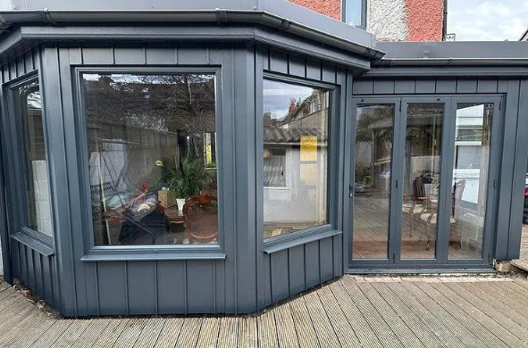
Breaking Down the Anthracite Color: It's More Than Just Gray
To truly understand what color anthracite paint is, you need to look at it through a few different lenses. It's not a one-note shade.
The Science and Source of the Name
The name isn't just marketing fluff. Anthracite, the coal, is a specific geological material. It's the highest rank of coal, known for being hard and lustrous. Its color is a reference point that paint companies have leaned on for decades. If you look at a piece of high-grade anthracite coal, you'll see that definitive deep charcoal color with a slight metallic sheen. Paint brands try to capture that essence—the depth, the slight coolness, the almost-stony quality.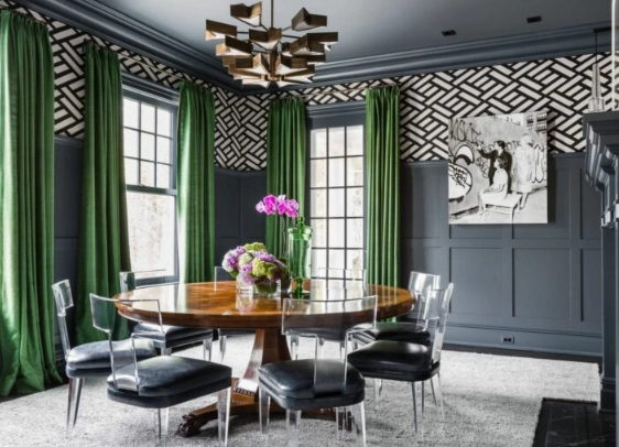
You can see how natural materials inspire paint colors by looking at resources from organizations like the British Geological Survey, which details the properties of minerals and rocks. It contextualizes why a name like "anthracite" carries a specific visual expectation.
Undertones: The Secret Life of Anthracite
This is the make-or-break factor. The base is a deep gray, but the undertone is what you'll notice as the light changes throughout the day. Most anthracite paints lean cool. This means you might detect hints of:
- Blue: Very common. It gives the color a crisp, modern, almost steely feel.
- Green: Less common, but present in some brands. It can read as a very dark slate or lead color.
- Violet: A rare twist, adding a touch of unexpected warmth to the cool base.
Here's my personal gripe: some brands have a "warm anthracite" that pulls in brown or taupe undertones. Personally, I think that strays too far from the original concept and can muddy the waters. If you want a warm dark gray, look for "charcoal brown" or "dark taupe." A true anthracite should have that cool, mineral-like quality.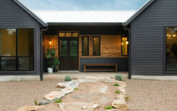
Anthracite vs. Other Dark Colors (The Comparison You Need)
This is where a table is worth a thousand words. Let's clear up the confusion between anthracite and its look-alikes.
| Color Name | Key Characteristics | Best For | Feeling it Evokes |
|---|---|---|---|
| Anthracite | Deep charcoal gray with cool blue/green undertones. Not pure black. | Modern exteriors, accent walls, cabinetry, front doors. Creating dramatic contrast. | Sophisticated, sleek, powerful, modern, stable. |
| Jet Black | A true, neutral black with minimal undertones. | High-contrast trim, furniture, theatrical backdrops. Absorbs all light. | Bold, definitive, classic, stark, dramatic. |
| Charcoal Gray | A broader category. Can be lighter than anthracite and may have warmer or cooler undertones. | Main wall colors (in lighter shades), upholstery, cozy spaces. | Comforting, neutral, versatile, grounding. |
| Iron Ore (e.g., Sherwin-Williams) | Often darker and blacker than anthracite, with softer, sometimes warmer undertones. | Modern farmhouse styles, exteriors, feature walls where a softer black is desired. | Earthy, organic, substantial, less stark than black. |
The main takeaway? Anthracite is the darkest member of the gray family that still clearly reads as gray, not black. If you hold it up to a true black, the difference is instantly apparent.
How Light Transforms Anthracite Paint (The Big Variable)
You cannot answer "what color is anthracite paint" without talking about light. This color is a chameleon. The same can of paint will look different in every single room of your house. It's fascinating and frustrating in equal measure.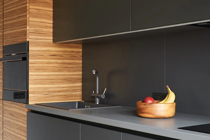
In bright, south-facing light: The gray becomes more apparent. You'll see the undertones (blue, green) most clearly. The color feels rich and deep but not overwhelming.
In low, north-facing light: This is where it can look almost black. The undertones recede, and the depth takes over. It can feel cozy and intimate, but in a very small room, it might become a bit too somber.
Under warm, artificial light (incandescent bulbs): The yellow light can neutralize the cool undertones slightly, making it appear as a more neutral, warmer dark gray. This is often a pleasant effect.
Under cool, artificial light (LED daylight bulbs): This will amplify the cool, blue undertones, making the color feel crisper and more modern, maybe even a bit colder.
Top Paint Brands and Their Take on Anthracite
Every brand has its own recipe. Here’s how some of the major players interpret the color, based on my own experience and countless forum deep-dives. It's worth noting that reputable brands provide detailed information on Light Reflective Value (LRV), which tells you how much light a color reflects. Anthracite colors typically have a very low LRV (often between 5-15), meaning they absorb most light.
- Sherwin-Williams "Iron Ore" (SW 7069): Arguably the most popular "dark gray that's almost black." It's often compared to anthracite but is usually a touch blacker and softer. LRV: 6. Check their official color palette for the most accurate swatch.
- Benjamin Moore "Wrought Iron" (2124-10): A classic deep charcoal with definite cool, steely blue undertones. This is a quintessential anthracite hue in my book. LRV: 6.25.
- Farrow & Ball "Off-Black" (No. 57): Don't let the name fool you. This is a gorgeous, complex dark gray with green undertones. It's the perfect example of a sophisticated, historic-looking anthracite. It's expensive, but the depth of color is incredible.
- Behr "Black Lacquer" (790F-7): Leans more toward a true black but in certain lights reveals its gray, charcoal base. A more budget-friendly option that captures the anthracite spirit.
My personal favorite for a true, cool-toned anthracite is Benjamin Moore's Wrought Iron. It just feels right—it's dark and dramatic without being funereal, and the blue undertone keeps it feeling fresh and modern.
Where and How to Use Anthracite Paint Successfully
Okay, so you know what color anthracite paint is. Now, how do you use it without your home looking like a dungeon? Here are the best applications, ranked from most foolproof to more adventurous.
Top Applications for Anthracite
- Exterior Doors and Shutters: This is a slam dunk. An anthracite front door is incredibly stylish, adds serious curb appeal, and looks great with almost any siding color (white, brick, beige, gray). It's welcoming in a powerful, confident way.
- Kitchen Cabinets: Especially lower cabinets or an island. Paired with light countertops (white quartz, marble-look) and brass hardware, it's a timeless, high-end look. Just make sure your kitchen gets decent light.
- Accent Walls: In a living room or bedroom behind the bed. It creates instant focus and depth. Perfect for a wall with a TV, as it minimizes screen glare.
- Exterior Siding or Trim: Modern farmhouses and contemporary homes rock this look. Anthracite siding with white trim is sharp. Anthracite trim on a lighter house adds definition.
- Powder Rooms: Small, windowless spaces can handle dark, dramatic colors. An anthracite powder room feels luxurious and intimate.
- Furniture: Bookshelves, dressers, bed frames. It's a great way to dip your toe in the water.
What Colors Go With Anthracite?
Anthracite is a fantastic team player. It makes other colors pop. Here’s your cheat sheet:
- Crisp Whites: The ultimate contrast. Think pure white trim (Benjamin Moore Chantilly Lace) against an anthracite wall. Clean and stunning.
- Warm Woods: Oak, walnut, teak. The warmth of the wood balances the coolness of the gray beautifully. It adds soul.
- Metallics: Brass and gold are trending and look amazing. Polished nickel and chrome for a cooler, more industrial vibe.
- Bold Colors: Mustard yellow, emerald green, navy blue. Use these in accessories (pillows, art, a single chair) for punches of energy.
- Soft Pastels: Blush pink, sage green. The combination is unexpectedly soft and modern.
Frequently Asked Questions (The Stuff You're Actually Searching For)
Is anthracite paint warm or cool?
Overwhelmingly cool. Its base is a cool gray, and it usually has blue, green, or violet undertones. That's what gives it that sharp, modern edge. If you find a "warm anthracite," scrutinize it—it might be a different beast altogether.
Does anthracite make a room look smaller?
It can, but it's not a hard rule. Dark colors recede, which can sometimes make walls feel further away. However, in a very small room with poor light, it will absorb light and feel cozy in the best case, cramped in the worst. The key is contrast and reflection. Pair it with high-gloss white trim and mirrors to bounce light around.
What sheen should I use for anthracite paint?
This is crucial. On walls, I'd stick to eggshell or matte. A flat finish can make such a dark color look chalky and uneven. Eggshell has a slight luster that helps the color look rich and deep. For trim, doors, and cabinets, a satin or semi-gloss is practical for cleaning and adds a beautiful depth. A high-gloss anthracite front door? Absolutely stunning, but it will show every imperfection in the wood.
Is anthracite a good color for a bedroom?
It can be incredible for a bedroom if you're going for a cozy, cocoon-like, and dramatic feel. It's actually quite restful. The trick is to balance it with plenty of textured, light-colored bedding, a light area rug, and good task lighting. Maybe just do the wall behind the bed, not all four walls, unless you have high ceilings and big windows.
How do I clean walls painted anthracite?
Carefully! In a matte or eggshell finish, scrubbing can burnish the paint (create shiny patches). Use a soft sponge or magic eraser gently with a mild soap solution. Test in an inconspicuous spot first. This is another reason why satin or semi-gloss is better for high-touch areas like doors and cabinets.
Final Thoughts: Should You Choose Anthracite?
Figuring out what color anthracite paint is was just the first step. The real question is: is it right for you?
If you love modern, sophisticated, and dramatic spaces, if you're not afraid of a little contrast, and if you're willing to put in the work to test samples, then absolutely yes. It's a timeless color that feels both current and classic. It adds weight and importance to the features you paint.
If you prefer light, airy, constantly bright spaces, or if you tend to play it safe with neutrals, you might find it intimidating. Maybe start with a piece of furniture or an exterior door instead of a whole room.
At the end of the day, understanding that anthracite paint is a complex, cool, deep charcoal gray is your foundation. From there, it's all about seeing how that foundation interacts with your light, your space, and your style. Grab some samples, make a mess on a poster board, and see what the color tells you. You might just find it's the perfect, powerful neutral you've been looking for.
And remember, when someone asks you "what color is anthracite paint?" you can now tell them it's not just a color—it's an experience that changes with the light.
