Quick Navigation
- What Are We Actually Talking About? Definitions First.
- The Core Differences: It's All in the Light
- Where It Matters Most: Application Showdown
- The Psychology & Mood: What You're Really Communicating
- Practical Considerations: The Nitty-Gritty Nobody Tells You
- How to Test and Choose for Your Project
- The Final Verdict: It's Not a Contest, It's a Toolbox
So you're trying to decide between anthracite and black. Maybe it's for your kitchen cabinets, a new car, a sofa, or even a website background. You know they're both dark, but something tells you they're not the same. You're right. The choice between anthracite color and black is one of the most common dilemmas in design, and getting it wrong can make a space feel off, an object look cheap, or an outfit miss the mark.
I've been there. I once painted a feature wall in what I thought was a sophisticated dark grey, only to realize in certain lights it looked like a flat, lifeless black hole. It sucked the warmth right out of the room. That experience sent me down a rabbit hole of understanding these colors, and what I learned changed how I see dark palettes completely.
This isn't just about picking a color. It's about understanding light, texture, mood, and context. Let's break it down, without the jargon.
What Are We Actually Talking About? Definitions First.
Before we dive into the anthracite color vs black debate, let's get our terms straight. This is where most online comparisons stop, but it's where we need to start.
Anthracite Color: The Sophisticated Grey
Anthracite is named after anthracite coal, which is a hard, glossy type of coal. The color isn't a single shade but a range of very dark, charcoal greys with subtle blue or brown undertones. It's a complex neutral. Think of a stormy sky just before nightfall, or the color of wet slate. It's dark, but it's not the absence of light; it's a deep, muted grey.
In technical terms, anthracite sits on the border between a very dark grey and a black. In design systems like Pantone or RAL, it has specific codes (like RAL 7016 for a standard anthracite grey), but in the real world, it varies. The key is that it reflects a tiny amount of light. This is the core of the anthracite vs black difference.
Key Insight: Anthracite is a color. Black, in its purest form, is technically the visual impression experienced when no visible light reaches the eye. In practical design and manufacturing, what we call "black" is usually a very dark pigment or dye that absorbs *most* light.
Black: The Ultimate Absorption
True black, like Vantablack (a substance developed by Surrey NanoSystems that absorbs 99.965% of visible light), is a scientific phenomenon. But in our daily lives—paint, fabric, cars—"black" is a very, very dark color made from pigments. It aims to absorb as much light as possible, offering minimal reflection. A matte black car and a glossy black piano are both "black," but the finish changes everything.
This is crucial. When people compare anthracite color vs black for practical purposes, they're often comparing a dark, complex grey to a near-light-absorbing dark color in a specific finish.
See the problem with a superficial comparison? We need to go deeper.
The Core Differences: It's All in the Light
The single biggest factor in the anthracite color vs black decision is how they interact with light. This affects everything from how big a room feels to how dusty your car looks.
| Aspect | Anthracite Color | Black |
|---|---|---|
| Light Reflection | Low, but present. Reflects 5-15% of light, showing its grey nature. | Extremely low. Absorbs most light, especially in matte finishes. |
| Visual Effect in Space | Adds depth and dimension. Helps define shapes and contours. | Can flatten surfaces, creating strong silhouettes and high contrast. |
| With Textures | Exceptionally good. Highlights texture (e.g., brushed metal, wood grain). | Can hide texture unless light grazes it directly. Matte black is particularly texture-hungry. |
| Color Undertones | Usually has subtle cool (blue) or warm (brown) undertones. | Can have blue, brown, or green undertones, especially in dyes/paints (e.g., "jet black" vs "black"). |
| Perceived Warmth/Coolness | Generally feels cooler than warm blacks, but warmer than pure black. | Pure black is neutral; undertones dictate warmth. Often feels stark. |
That table tells a story. Anthracite is more forgiving and revealing. Black is more dramatic and demanding.
Let me give you a real example. I chose anthracite grey for my window frames. Why? In bright sunlight, they don't get scorching hot like black frames would, and they show the quality of the powder coating. A neighbor went with pure black. From the street, his windows look like flat holes in the wall. Mine have a bit of sheen and look more integrated. Small choice, big visual impact.
Where It Matters Most: Application Showdown
The anthracite vs black difference plays out uniquely in different fields. Let's walk through the big ones.
Interior Design & Home Decor
This is a battlefield. Pick wrong, and a room can feel cozy and intimate or cold and cavernous.
Anthracite in Interiors
Pros: It's the modern designer's secret weapon. It adds sophistication without the severity of black. It makes a great background for artwork and colorful furniture. It works wonderfully with both warm woods (oak, walnut) and cool metals (brushed nickel, chrome). It's easier to keep looking clean than pure black, which shows every speck of dust.
Cons: In a very poorly lit room, it can still feel dark and gloomy. The undertone is critical—a blue-toned anthracite in a north-facing room can feel icy.
Best for: Feature walls, kitchen cabinets (especially with a matte finish), modern fireplace surrounds, door and window frames, contemporary furniture.
Black in Interiors
Pros: Unmatched drama and graphic impact. Creates incredible contrast. A glossy black accent wall can feel like a lacquered jewel box. It grounds a space and makes other colors pop violently.
Cons: It's high-maintenance. Shows fingerprints, dust, and water spots relentlessly. Can make small rooms feel smaller and ceilings feel lower if overused. It can feel harsh and unforgiving.
Best for: Accents only (picture frames, light fixtures, hardware), doors, statement furniture pieces (a black leather sofa), high-gloss finishes in well-lit spaces.
My rule of thumb? For large surfaces you touch or see daily (cabinets, walls), lean towards anthracite. For punctuation marks (hardware, legs of a chair), black can be stunning.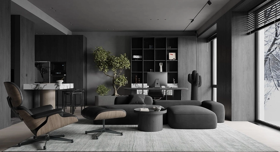
Fashion & Personal Style
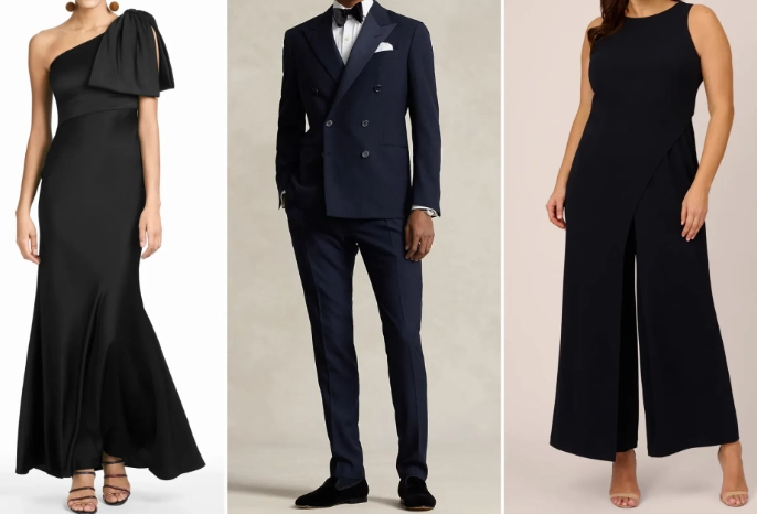
"Little black dress" versus "anthracite grey suit." Both are powerful, but they communicate differently.
Black in fashion is authoritative, formal, and slimming. It's a uniform. But it can also be severe. Anthracite, in a wool coat or a knit dress, is perceived as more nuanced, more modern, and slightly less formal. It's still serious, but approachable. It's less likely to show lint or pet hair than black, which is a practical godsend.
In terms of pairing, black creates stark contrasts (black and white). Anthracite plays well with a wider, softer palette—navy, olive green, blush pink. It's a more versatile base color for building an outfit.
Automotive & Product Design
Look at any premium car brand's configurator. You'll almost always find a "metallic black" or "obsidian black" and a "dark graphite" or "anthracite grey" option.
Black cars are classic, sleek, and look incredibly sharp when clean. But they're famously difficult to maintain, showing every swirl mark, scratch, and layer of pollen. They also get hotter in the sun. Anthracite grey (often a metallic paint) hides minor imperfections and dirt much better. It shows the lines and curves of the car's body in a more subtle, sculptural way. It reads as modern and technical.
The same logic applies to electronics, appliances, and gadgets. An anthracite grey speaker or laptop looks premium and tech-forward. A black one looks more universal and discreet. The choice in product design often hinges on brand identity—techy and innovative (anthracite) versus classic and reliable (black).
The Psychology & Mood: What You're Really Communicating
Colors talk. When you choose between anthracite color and black, you're picking a vibe.
- Black screams power, luxury, elegance, mystery, and formality. It can also signal menace, austerity, or finality. It's a definitive statement.
- Anthracite whispers sophistication, stability, intelligence, and modernity. It feels balanced, grounded, and slightly more approachable. It's authoritative without being authoritarian.
Think about a law firm's website. A pure black background might feel intimidating or funereal. An anthracite background with white text feels strong, stable, and premium. It's a nuance that users feel intuitively.
Practical Considerations: The Nitty-Gritty Nobody Tells You
Beyond looks, life happens. Spills, sun, and time affect these colors differently.
Maintenance and Durability
Black is the high-maintenance superstar. It fades in sunlight (often to a brownish or bluish hue). It shows every single scratch, water spot, and speck of dust. A matte black finish is especially fragile and hard to touch up.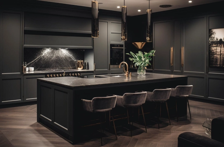
Anthracite is more forgiving. Dust and light scratches are less visible. Sun fading is less apparent because it starts as a complex blend, not a pure tone. If you're painting an exterior surface or choosing a color for a high-touch item, anthracite's practicality is a massive advantage.
Heat Absorption
This is a big one for exteriors, cars, and roofs. Darker colors absorb more heat. However, because anthracite reflects slightly more light than black, it will generally stay slightly cooler in direct sunlight. For something like a metal roof or a car parked outside, this can translate to real differences in interior temperature.
Resources like the U.S. Department of Energy's guidelines on cool roofs discuss how color affects the solar reflectance and thermal emittance of surfaces, which is directly relevant to this anthracite color vs black consideration for buildings.
Common Questions Answered (The Stuff You Actually Google)
How to Test and Choose for Your Project
Don't guess. Your screen lies. Lighting changes everything.
- Get Large Samples. Paint samples on a poster board, not directly on the wall. Get fabric swatches bigger than a postage stamp.
- Observe for 24+ Hours. Look at them in morning, noon, evening, and artificial light. The anthracite vs black difference will shift dramatically. Anthracite will show more variation; black will just look darker or lighter.
- Place It in Context. Hold the sample next to your flooring, countertop, or other fixed elements. Does the anthracite pull blue next to your warm wood floor? Does the black look greenish?
- Consider the Finish. A matte anthracite and a glossy black are worlds apart. The finish can be more important than the base color. A glossy anthracite can feel brighter than a matte black.
- Think About Adjacent Colors. What will be next to it? White trim makes both pop, but warm white (like Swiss Coffee) softens anthracite, while pure white (like Chantilly Lace) sharpens black.
The Final Verdict: It's Not a Contest, It's a Toolbox
After all this, you might want me to declare a winner in the anthracite color vs black battle. I won't. Because that's the wrong way to think about it.
They are different tools for different jobs.
Choose Anthracite Grey when you want depth, sophistication, modernity, and a more forgiving, textured look. It's your go-to for large surfaces, contemporary spaces, and when you need dark drama that doesn't suck the life out of a room.
Choose Black when you want maximum drama, stark contrast, timeless elegance, and a graphic punch. Use it as a powerful accent, for statement pieces, or in spaces where you can control lighting and maintenance.
The smartest designers often use both. An anthracite sofa with black throw pillows. Anthracite kitchen cabinets with black hardware. A black car with anthracite grey alloy wheels.
The real takeaway from this anthracite vs black difference deep dive is to see them not as rivals, but as partners in a dark, sophisticated palette. Understand their language—how they play with light, hide flaws, and make people feel. Then you're not just picking a color from a swatch. You're making a deliberate design decision that will shape the feel of your space, your product, or your style for years to come.
And honestly? Once you start seeing the difference, you can't unsee it. It makes looking at the world around you—buildings, cars, interiors—a lot more interesting.